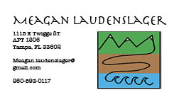
These 3 business cards are a representation of myself and the designs that I previously made in Illustrator. I touched on the meaning of the logo in that post, but to recap the logo is about my journey from my small town in the mountains to the sandy beaches of Florida. I chose a more simple design for my business cards in that I want to go back to the simple life myself, and really be able to enjoy everything that comes my way. I loved how the fonts were fun yet professional enough to make it seem like I was in business, but did know how to have a good time. I also didn't want to have too much information on there as I didn't think that would make a good first impression if I were to give someone these business cards. Overall I went for the simple yet effective look and feel.


Dear, Meagan
ReplyDeleteOverall, I really like how you made your business card almost look like its a letter being sent out. This was a very creative idea because a lot of other people did not make theirs like that. I also like the first one a lot more because you were more interactive with different colors. Overall, a great job.
Hi Meagan! I like how all of your business cards tie together really well. I think the colors come off as very professional. The way you were able to incorporate who you are on a tiny business card is really impressive. Great job!
ReplyDeleteMegan, I think your logo is unique, and on the business card it makes it look professional. I love the font you used for your name, and the layout you used on the first example.
ReplyDeleteYour business cards look great! The logo is unique and the font you choose is really appealing. The pattern with the mountains and waves is really cool, especially how they are all connected by one singular line. However, I feel that all 3 pairs of cards are very similar and there could be more variety. Great job!
ReplyDeleteYour business cads came out superb! The logo is so simple yet so appealing and thats what makes it look professional. Also the layout is very organized and business-like.
ReplyDeleteHey Megan, I really liked your business cards. They are simple and I really like the colors that you chose because it makes them more appealing. It is simple and professional, good job!
ReplyDelete