Tagprint
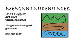
I used a variety of different colors and sizes of the logo. I chose to cut out some of the road to add the graffiti parts within to make it a little more fluid as well as add something extra to the design so it wasn't a big square. That is also the same reason I chose to go along the edges of the mountain. The colors I chose are for the big one blue and green for both the water and the mountains. The other colors I was just experimenting and figuring out different colors that looked good together. My favorite color growing up was pink so I wanted to have one that was pink.


Comments
Post a Comment