Posts

Business Cards

Image
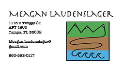
These 3 business cards are a representation of myself and the designs that I previously made in Illustrator. I touched on the meaning of the logo in that post, but to recap the logo is about my journey from my small town in the mountains to the sandy beaches of Florida. I chose a more simple design for my business cards in that I want to go back to the simple life myself, and really be able to enjoy everything that comes my way. I loved how the fonts were fun yet professional enough to make it seem like I was in business, but did know how to have a good time. I also didn't want to have too much information on there as I didn't think that would make a good first impression if I were to give someone these business cards. Overall I went for the simple yet effective look and feel.

In Design Tutorials

  Get Started with 10 Beginner Tips for InDesign This video was really helpful in that it went though 10 easy things that you can do with InDesign and went into detail about how to use them. One of the things that was mentioned in the video is how to hyphenate or remove the hyphenation from a body of text as well as how to create a box of text and place filler text in to see what it will look like before adding the actual text. Another really helpful tip that was included in the video was how to change the text case format. I thought originally that this was going to be hard to do but the video explained it step by step and made it sound easy. I think that this tool is going to be the most helpful in that it will save a lot of time in not having to re type everything. The video also showed how to change the colors of the text, part of the text, and the container of text so the text box is filled in with color but the text color doesn't change. The last tip that was in the video tha

Autoscopy

Image
  Recently I have been watching all of the marvel movies so I decided that it was going to be a fun idea to try and combine the world that I have now and something that isn't real. I chose a different sky and color scheme to make the alien world pop out a bit. I added a horse running because as a kid I always loved riding horses. I then added the UFO, birds and the avengers quinjet to make it something that isn't possible. Bringing the 2 worlds together in different colors almost making it look like it wasn't taken on earth but somewhere else. The images below are all of the original images that went into this final product. 

Somewhere

Image
  I chose to use a photo of myself on a beach because I have always liked the beach and I found that there are a lot of different pictures and options for photoshopping myself into another beach photo. Somewhere I have always wanted to go since I was a kid was Australia so I thought that would be a good place to put myself. I thought that it would add something else to the photo and I found while searching for photos options that would include a kangaroo in the picture as well. I have also always wanted to see a real kangaroo in person so I thought that this was a fitting addition to the photo.

Somewhere Inspiration

Image
  I think that it would be really hard to photoshop myself into this photo because there are a lot of things going on and a lot of other objects in the background that I would have to blend myself into. I do think that this photo is funny and different. I would be able to have a lot of fun in this photo.  This gave me a good idea as I never thought about photoshopping myself into something like a magazine. This inspired me in that it made me realize that there is a lot more that you can do with photoshop and gave me some ideas on how creative people can be with it.  This photo made me laugh because some people do use photoshop in social media to make themselves look skinnier, have a bigger butt and all of those things so I thought that this was a funny interpretation. Instead of changing the person's features in the photo they added a donkey. I think the donkey in the photo is a better addition to having a bigger butt. I think I want to recreate / do something similar to this photo

Tagprint

Image
 I used a variety of different colors and sizes of the logo. I chose to cut out some of the road to add the graffiti parts within to make it a little more fluid as well as add something extra to the design so it wasn't a big square. That is also the same reason I chose to go along the edges of the mountain. The colors I chose are for the big one blue and green for both the water and the mountains. The other colors I was just experimenting and figuring out different colors that looked good together. My favorite color growing up was pink so I wanted to have one that was pink.

Photoshop tools

 1. https://www.youtube.com/watch?v=BQQqnn2uZv4  this video was showing how to remove a background in photoshop. This seems pretty easy to use and doesn't take a lot of steps. This is a really good tool to know and use as it will make layering things on top of each other a lot easier as well as the video goes in a lot of depth and shows the steps and the tools to use them. The video was very clear in the things that you needed to do in order to remove a background as well as giving an explanation to the different selection tools and how they are used. It also talked a little about the brush tool which I can tell is going to be something very important to understand. One thing I find interesting about the video is that there are a lot less steps then I thought there would be and there are a lot of things that you can do with it then I thought there would be. 2. https://www.youtube.com/watch?v=2cQT1ZgvgGI this video goes through and explains all of the tools that are found in photosh